USAA Youth Account Application Concept
I recently setup my children with bank accounts and was not satisfied with the options available. I tried new companies Greenlight and Step but they had MVP limitations (Step) or charged fees. In the end I created "Youth Accounts" for both children at the bank I use, USAA. While the functionality is good, the experience is aimed at experienced customers with complex needs and multiple accounts. That's not what a 14 year-old needs.
I decided to create the high level customer needs and translate them into a conceptual prototype. I used a customer & design driven process where I determine the high level customer needs, create a draft design and then translate those into detailed user stories. What's needed is:
A dedicated app focused on youth checking accounts
• Home screen containing basic information
• Ability to transfer money
• Ability for basic management of the account
• Integration with external solutions such as Apple Pay and Google Pay
• Home screen containing basic information
• Ability to transfer money
• Ability for basic management of the account
• Integration with external solutions such as Apple Pay and Google Pay
Core banking services
• A physical debit card
• Access to ATMs
• Highly secure access
• A physical debit card
• Access to ATMs
• Highly secure access
Key Parental controls
• Set during account creation
• Ability to temporarily block account transactions
• Notifications of the child's spending
• Management of more advanced functionality,
such as ordering checks and transferring accounts
• Set during account creation
• Ability to temporarily block account transactions
• Notifications of the child's spending
• Management of more advanced functionality,
such as ordering checks and transferring accounts
A modern, simplified experience
• Clean, simple functions
• Removal of functionality that is becoming outdated,
such as raised credit card numbers
This also gave me the opportunity to improve my skills using Figma.• Clean, simple functions
• Removal of functionality that is becoming outdated,
such as raised credit card numbers
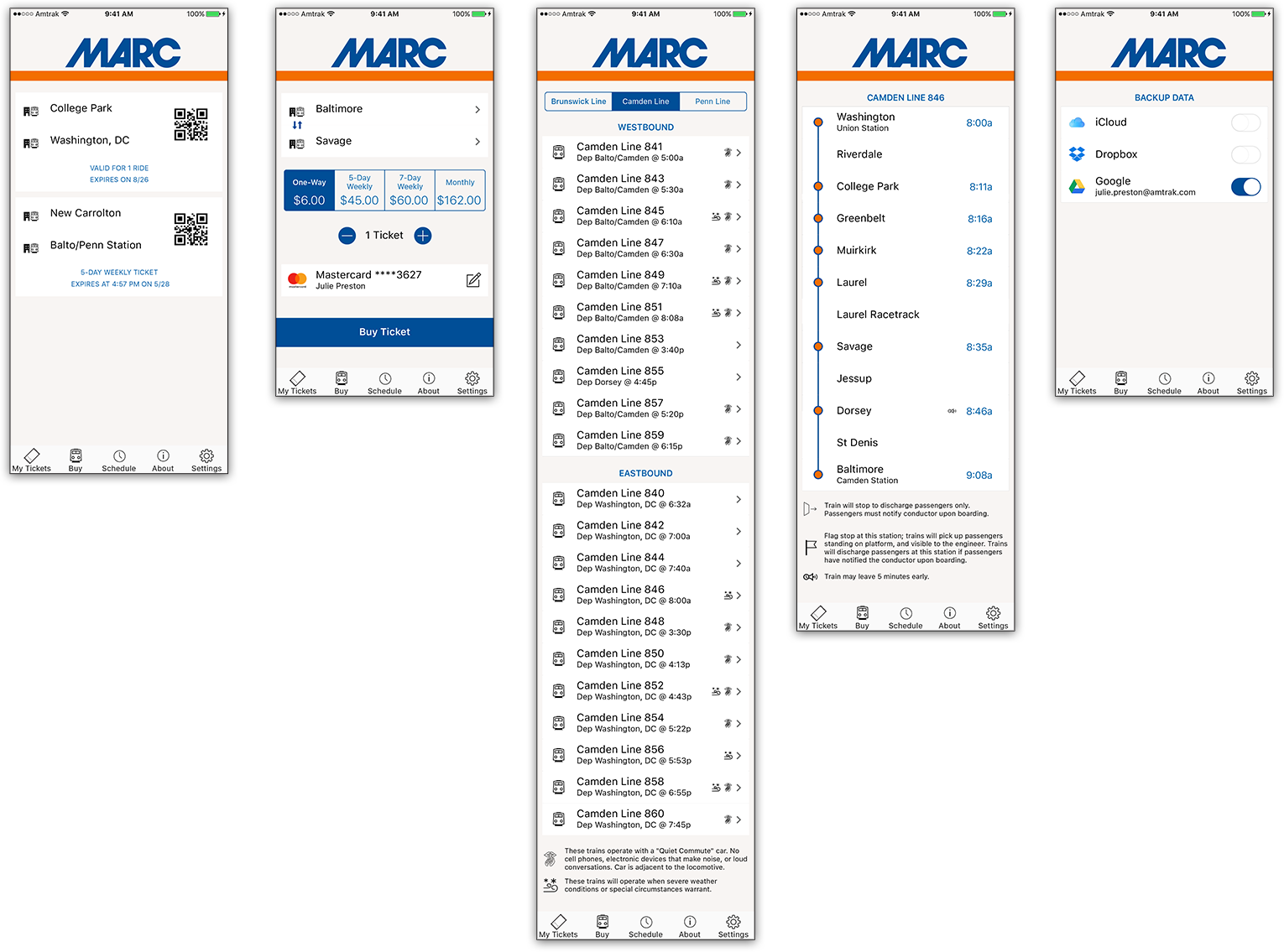
Wireframe of Proposed Commuter Rail App
This wireframe was developed as part of a proposal to run the MARC (Maryland Area Regional Commuter) rail system. This app focused on a simple interface that would tie into Amtrak's robust backend infrastructure. Some of the key requirements were support for purchasing multiple types of tickets, storage of previously purchased tickets and schedule information.
The design was designed to work for other commuter rail operations through a simple replacement of graphics and color scheme.
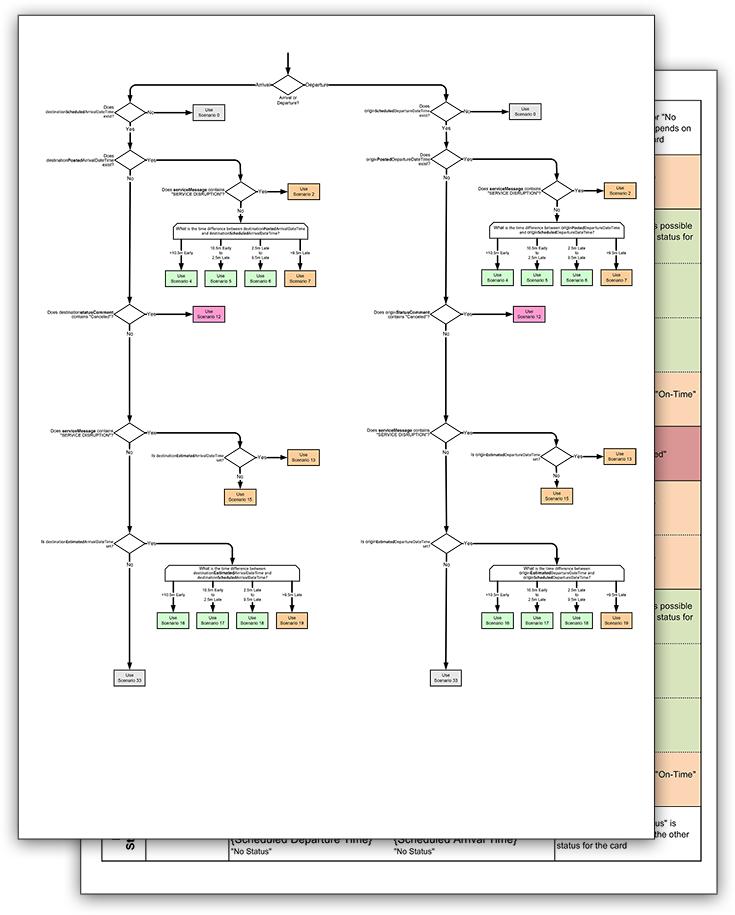
Train Status Logic Flow
Amtrak needed to support a multitude of scenarios for train statuses. Prior to the development of the mobile applications these scenarios and the associated API values had not been documented.
This flow identified all the potential scenarios displayed on the mobile applications and the logic behind identification from the APIs.
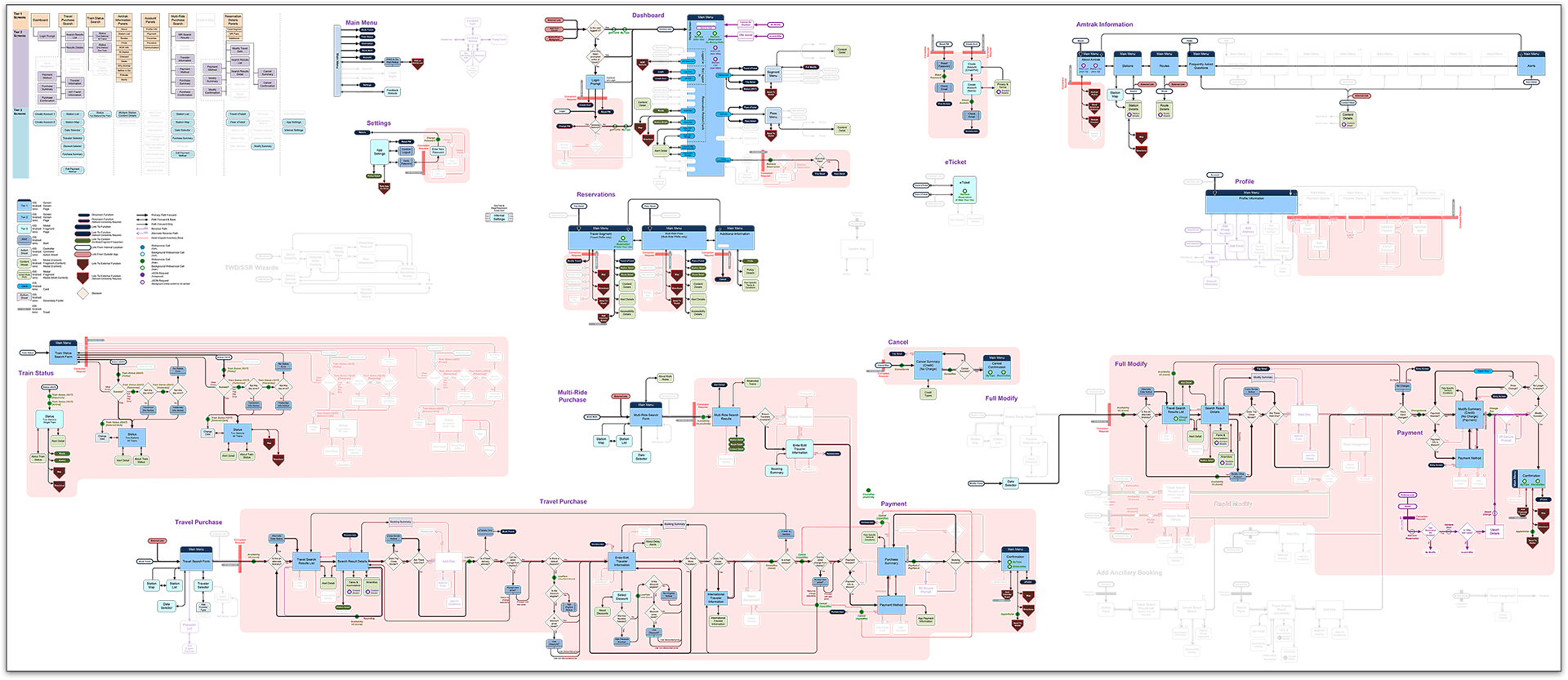
Amtrak Mobile Application Flow
With any application there is a need to understand the customer flow and logic. The Amtrak app is a complex eCommerce solution and the need for a clear design was critical. I created this flow diagram to ensure everyone understood how the app worked.
Not only does it cover the current functionality but it includes planned features so current development is "future friendly".