USAA Youth Account Application
I recently setup my children with bank accounts and was not satisfied with the options available. I tried some newer companies Greenlight and Step but decided against them because they had MVP limitations (Step) or charged fees. In the end I created "Youth Accounts" for both children at the bank I use, USAA. While the functionality is good, the experience is aimed at experienced customers with complex needs and multiple accounts. That's not what a 14 year-old needs.
As a product management exercise I decided to document high level customer needs and translate them into a conceptual prototype. Using this customer & design driven process allowed me to create something focused on a teenage user. I determined the key functionality needed is:
Core banking services
• A physical debit card
• Access to ATMs
• Ability to transfer money, externally and to parents
• Highly secure access
• Access to ATMs
• Ability to transfer money, externally and to parents
• Highly secure access
A dedicated app focused on youth checking accounts
• Initial screen containing account information
• Key information about the account
• Ability to manage the debit card
• Integration with external solutions such as Apple Pay and Google Pay
Key Parental controls• Key information about the account
• Ability to manage the debit card
• Integration with external solutions such as Apple Pay and Google Pay
• Set during account creation
• Ability to temporarily lock account transactions
• Notifications of the child's spending
• Management of more advanced functionality,
such as ordering checks and transferring accounts
• Ability to temporarily lock account transactions
• Notifications of the child's spending
• Management of more advanced functionality,
such as ordering checks and transferring accounts
A modern, simplified experience
• Clean, simple functions
• Removal of functionality that is not appropriate or is becoming outdated
• Removal of functionality that is not appropriate or is becoming outdated
Of particular note is the functionality I removed. A teenager doesn't need to wire transfers, dispute charges or deposit checks. In the rare situations when these are needed their parent can do them through the main USAA app. And of the features that I included, all of them exist in the current app. This is simply a UX change to focus on a different type of customers. One size fits all usually means tradeoffs for someone.
One of the great things about Figma is how easily I can share the concept with the world.
The Amtrak Mobile Application
In 2011 I launched the first mobile application for Amtrak and over the next years evolved it into a fantastic solution for customers. It's very popular and has become one of the primary ways customers interact with Amtrak.
We started with a simple iPhone app, then added Android. Along the way we also launched (and retired) a Windows Phone version. New features were added and revamped the UI. Finally we brought it together in v3 which was a full rewrite. The underlying design became a robust, manageable platform for the future.
UX Design
I owned the UX/UI design and focused on taking a complex set of features and make them simple for customers. We had to stay consistent across Amtrak touchpoints while being faithful to the device operating system. The focus was on minimizing the number of user interactions while maximizing functionality.
Purchasing multi-ride tickets is a great example. I brought it to the app and customers instantly loved it. Within 2 months it was the #1 channel for these sales.
The Hidden Experience
Throughout the application are opportunities to make the experience better. By applying logic behind the scenes I was able to deliver the right information to customers at the right time.
Designed For Operational Performance
Making sure that the application could be easily maintained was paramount. The days of managing two sets of code were gone. Customer information and content was cached using background webservice calls so display was nearly instant. Most of the app works even without cellular coverage.
Not only did we focus on customer performance but we also made sure we could update much of the application without needing to release a new version. Through CMS integration for JSON and graphics we had total control. Every graphic and piece of text could be changed remotely.
Train Status Logic Flow
Amtrak needed to support a multitude of scenarios for train statuses. Prior to the development of the mobile applications these scenarios and the associated API values had not been documented.
This flow identified all the potential scenarios displayed on the mobile applications and the logic behind identification from the APIs.
Amtrak Mobile Application Flow
With any application there is a need to understand the customer flow and logic. The Amtrak app is a complex eCommerce solution and the need for a clear design was critical. I created a flow diagram to ensure everyone understood how the app worked. This diagram captures the details of how the product works and what needs to happen where. It's like an information architecture on steroids.
Not only did it cover current functionality but included planned features so development could be "future friendly".
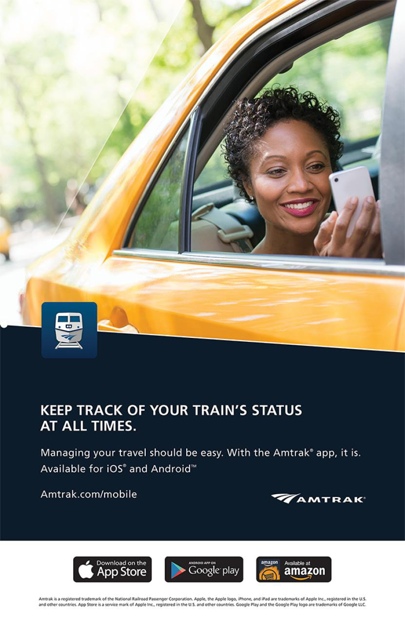
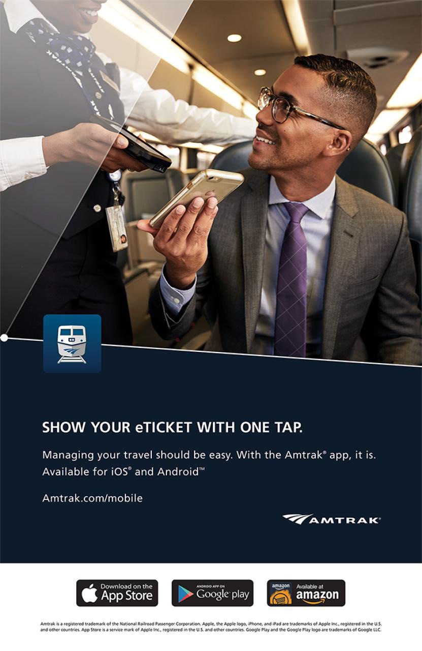
Amtrak Mobile App Posters
As the owner of the mobile applications I drove the creation of posters to build awareness among customers. Working with the marketing and brand teams we delivered communications that focused on the most used features.
These materials were displayed in Amtrak stations, onboard trains and used as advertisements in the onboard magazine.


Amtrak Presence In App Stores
I was responsible for the experience customers saw in Apple's App Store, Google Play, Amazon appstore and the Microsoft Marketplace. This brought a deep understanding of what was needed for display and what was available.
In most companies there is a gatekeeper who is responsible for ensuring everything in the stores is correct and manages who has access to what. That was me.
Third Party Integrations
As new mobile functionality was introduced from third parties we integrated them into the mobile environments. Amtrak was a launch partner for Apple Passbook (now called Apple Wallet) and an earlier partner for the Samsung competitor. Apple Wallet is still a great place for customers to store their eTickets.
Other companies reached out and as the company made agreements I delivered on the mobile integrations.
Analytics For All Things Mobile


At Amtrak, analytics were decentralized until shortly before I left. I administered Google Analytics, for apps and mobile web, plus App Store analytics. I was a major stakeholder during the consolidation into Adobe Analytics and drove many of the requirements.
Mobile analytics were the most robust of any sales channel and provided unique information.
Executive Presentation For Partner Summit
Drafted a presentation deck for client executive to present at their international partner summit. It was loaded with industry and client specific statistics and research.
Arrive Magazine Application
I identified a solution to bring the onboard magazine to customers through iOS and Android applications. The solution had minimal incremental cost to Amtrak.
The app ended life when Arrive was replaced with a new onboard magazine, The National.
Mobile Satellite Ventures Device Family
In order for potential customers to understand the size reduction possible with MSV's technology I led the creation of the first generation of devices. These designs and mocked up devices delivered on what we needed.
I am the first name on the design patents.